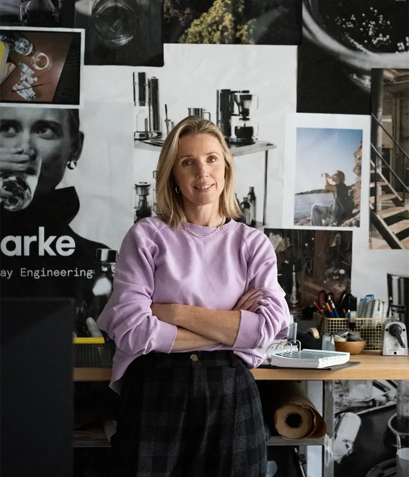
In the contemporary design landscape, few categories have remained as stubbornly utilitarian as the kitchen appliance. Traditionally viewed as disposable, single-purpose utilities meant to be hidden away in dark cabinets or deep drawers, everyday kitchen tools have long missed out on the thoughtful interplay of form and function that defines modern interior architecture. Enter Aarke, the premium Swedish kitchen appliance brand that is fundamentally altering this narrative. For the sixth installment of Navigators of Design—a ten-part interview series produced in collaboration between designboom and Most Studios—the platform connects with Malin Gäfvert, Creative Director at Aarke, to explore how modern brand building can successfully transition ordinary objects from background utilities into elevated lifestyle artifacts.
Stepping into the digital and physical frontier of contemporary brand development, Gäfvert’s creative direction focuses on injecting tangible worth into mundane daily moments. Rather than treating kitchen devices as fleeting commodities destined for the landfill, her holistic approach transforms routine household tasks into quiet rituals of understated design. This philosophy anchors the brand’s entire ethos, bridging the gap between raw industrial engineering and the deeply personal, lived-in spaces of the modern home.
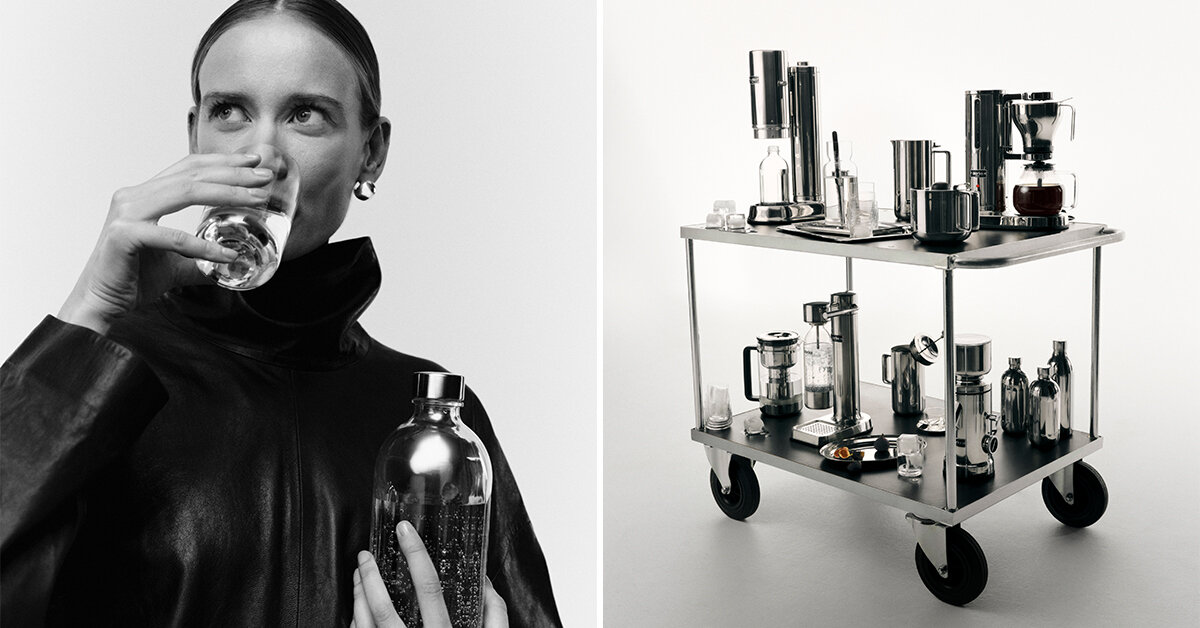
THE INTERSECTION OF PRODUCT DESIGN, INTERIORS, AND FASHION
Founded in 2013 by experienced industrial designers Carl Ljungh and Jonas Groth—whose name is derived Aarke from the Southern Sami word for "everyday"—the company was originally established to refine forgotten home essentials. While the founding pair continues to spearhead industrial design and product engineering, Malin Gäfvert shapes the intangible ecosystem that surrounds these objects. By establishing a distinct brand identity, she successfully bridges product design, interior space, and fashion imagery, defying the rigid conventions of traditional appliance marketing.
"Our visual identity doesn’t have to look like a typical appliance brand. It shouldn’t. I think we are more at the intersection of product design, lifestyle, interior, and fashion," Gäfvert notes during her conversation with designboom. This cross-pollination of disciplines allows the brand to avoid the sterile tropes of the home goods sector. "One defining decision was building a distinctive identity—an identity with a few cues, repeated consistently, that carry the brand and build recognition. In our storytelling, that shows up as Everyday Engineering: celebrating how Aarke integrates into daily life, not just talking about what the products do and perform, but how they improve your everyday, your lifestyle, your kitchen."
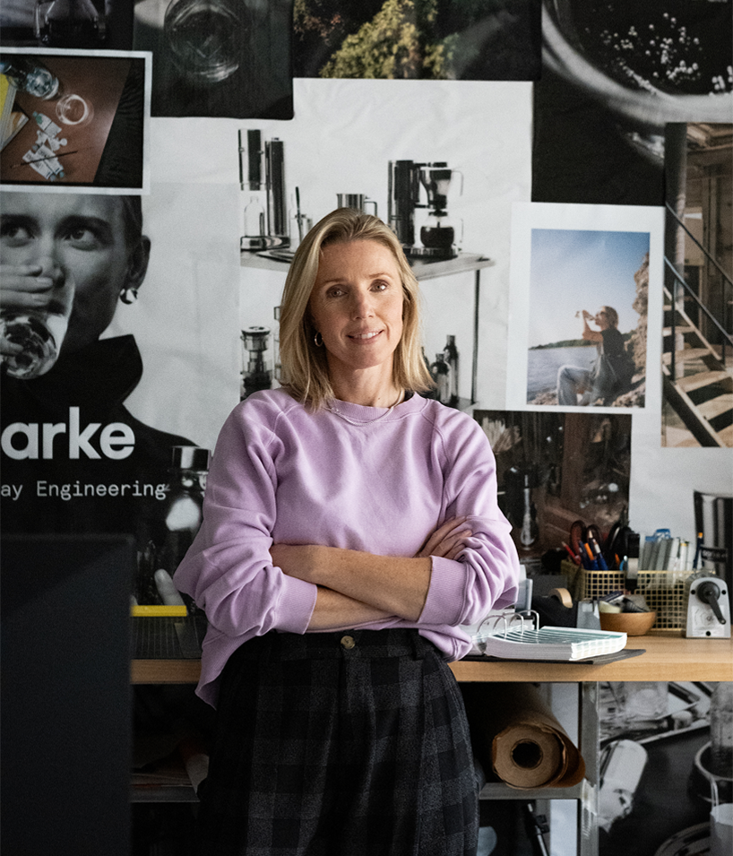
This commitment to lifestyle integration stems from a simple, foundational insight identified by the brand at its inception: the kitchen category had long been overlooked by creative visionaries, failing to evolve in step with other areas of home design. Sparkling water makers, for instance, were historically bulky, unsightly plastic devices that consumers actively sought to conceal. Aarke’s core mission was to replace the disposable with the desirable, crafting pieces that users actually want to display proudly on their countertops—pieces engineered to stand the test of time and endure the wear and tear of daily observation for years to come.
HOW AARKE BALANCES FORM, FUNCTION, AND CULTURAL RESONANCE
Driven by a clear and unwavering strategic vision, Aarke’s creative direction deliberately shifts the industry focus away from pure functionality and toward deeper emotional resonance. By placing the primary emphasis on what everyday objects represent rather than merely what they mechanical do, the brand establishes a cohesive, harmonious narrative across its entire product collection.
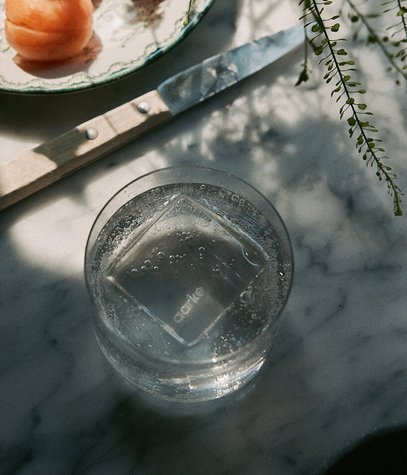
"We treat the product like a piece of design from day one, rather than as an accessory that gets shoved in a cupboard between uses," explains Malin. "In our branding, function became the entry point, not the whole story. We really emphasize how we can inject a sense of worth into the everyday, mundane tasks you do, turning those moments from ordinary to extraordinary by transforming them into small rituals."
This philosophy manifests visually through a careful calibration of precise product close-ups that highlight materiality, tactile finishes, and structural form, balanced against dynamic lifestyle imagery. To prevent the aesthetic from slipping into a cold, lifeless minimalism, the brand intentionally incorporates physical evidence of human interaction, introducing warmth and authentic context to the overall design narrative.
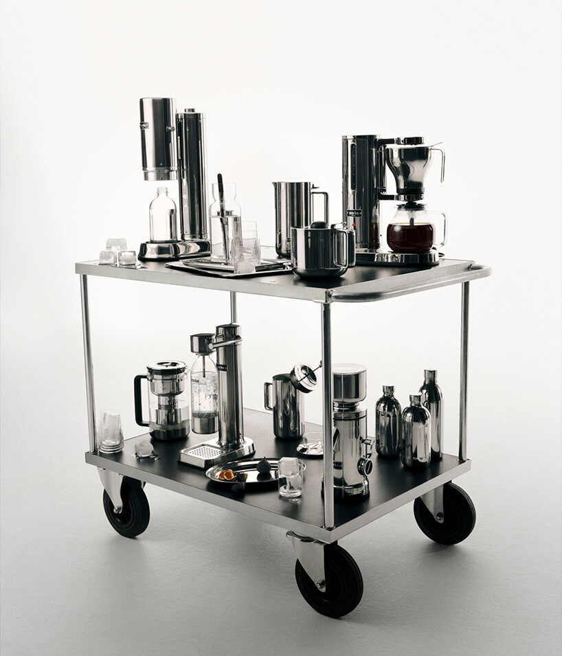
"Minimalism only feels cold when it’s empty of narrative. Our fix is to balance the more product-close visuals we do, where we focus on design and tactile material, and mix them with visuals that bring in the physical evidence that a human being is present and using the thing," declares the creative director. "In art direction, that means we favour authentic settings, capturing real moments, shot in ambient light, often on analogue film. It creates a nice contrast between the two visual worlds we’re in: from the precise product-focused engineering to the real everyday moments in the home. That tension, between the engineered and the everyday, is what makes the brand interesting and recognisable."
By anchoring its creative output in daily routines, Aarke consistently produces objects engineered to eliminate minor domestic frustrations and visual clutter. This user-centered perspective actively steps away from the frantic pace of fast-moving trends. Instead, it elevates everyday items through thoughtful storytelling that adapts flexibly to seasonal shifts. Rather than altering its core identity to chase brief fads, the brand relies on a deliberate tone and precise timing. Furthermore, internal quality filters ensure that every customer touchpoint—from physical packaging and unboxing experiences to physical retail environments—mirrors this exacting design standard, establishing a unified and uncompromising identity.
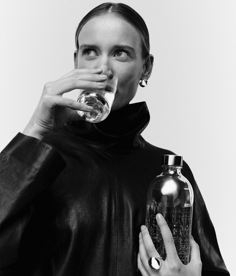
"Moments that happen every day deserve better design, because those are the moments people actually live in, repeatedly. They should be free from mess, errors, and bumps," concludes Malin Gäfvert. "Aarke’s product philosophy: durability, longevity, quality materials, considered design—doesn’t move with trend cycles. But the way we talk about it can flex and adapt: seasonal content, cultural moments, platform-native formats, etc. We can jump on a craze if we think it’s interesting and has something to do with us. And if we do, it happens at the edges, never in the object or the core message."
As part of the Navigators of Design series, produced in collaboration between designboom and Most Studios, these conversations continue to document the senior leaders—including CEOs, Creative Directors, and Heads of Design—who are actively navigating unprecedented shifts in the global design landscape. By rethinking workflows and redefining design as a core business differentiator, visionaries like Gäfvert are successfully lifting the broader industry to new heights.