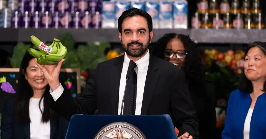
New York City’s ambitious pilot plan for city-owned and subsidized grocery stores might conjure up grim, utilitarian images for skeptics—dreaded visions of dingy gray Soviet commissaries or the scuffed linoleum floors of a 1980s Department of Motor Vehicles office. However, the actual visual identity, branding, and design for Mayor Zohran Mamdani’s upcoming municipal markets are shaping up to be entirely different. Far from austere or bureaucratic, the creative efforts behind the initiative are being spearheaded by prominent design firms known for vibrant, dopamine-inducing graphics, playful retro typography, and whimsical branding strategies.
The team tasked with creating the look and feel for New York’s heavily subsidized milk, eggs, and pantry staples features the exact creative minds responsible for some of the most recognizable millennial and Gen Z consumer brands on modern grocery shelves. Among them are the creators behind Graza olive oil, packaged in its signature squeeze bottles, and Magic Spoon, the psychedelic, nostalgia-driven cereal boxes featuring wizards riding cartoon rabbits.
The overarching design elements for the project are being handled by Gander, a Brooklyn-based creative firm that successfully won New York City’s call to envision the brand identity and visual language for an initial network of five municipal supermarkets, the first of which is slated to open as early as next year. The request for proposals originated from the New York City Economic Development Corporation (NYCEDC). Following a competitive selection process, the EDC officially named three additional specialized firms that will collaborate under Gander’s leadership to bring the project to life.
That supporting roster includes Noble Signs, the design and fabrication shop famous for crafting the nostalgic, retro-looking storefront exteriors of Radio Bakery and Upside Pizza, as well as playfully flipping a Park Slope storefront sign from "Wash" to "Mash." Joining them is Librarie, a communications and consultancy studio specializing in copywriting and brand strategy, alongside Seven Roots, a Wisconsin-based company with deep expertise in building and advising independent grocery stores and food co-operatives.
The composition of this multidisciplinary team aligns logically with the complex logistical and public relations challenges of launching a municipal retail enterprise. Noble Signs brings a strong understanding of how retail environments interact with the streetscape, positioning the firm to handle exterior signage and wayfinding placards that will guide shoppers efficiently toward fresh produce, rice, beans, and other essentials. Librarie faces the task of developing a permanent moniker for the project, as "N.C.Y. Groceries" currently functions merely as a temporary stand-in. The studio’s expertise in navigating brand communications will prove vital as the administration opens retail spaces in what promises to be a complex political and social landscape. Meanwhile, Seven Roots ensures that the project remains grounded in retail reality rather than existing merely as an aesthetic exercise, offering crucial counsel on operational fundamentals such as optimal aisle widths, checkout counter flow, and efficient inventory restocking procedures.
While Gander was officially selected for the initiative due to its recognized expertise in the grocery and consumer product space, its portfolio outside of products tailored to millennial pantry shelves is largely focused on Pop Up Grocer. That enterprise constructs temporary retail spaces engineered to feel like high-fashion boutiques, designed explicitly to highlight eccentric and specialty items such as mushroom chocolates and antelope-liver supplements.
Aside from the designated neighborhoods and anticipated opening timelines—with three of the initial store locations still being finalized and worked out by city officials—broader details regarding the daily operations of the municipal supermarkets remain under wraps. Still, this heavy emphasis on design and visual culture comes as little surprise to observers of Mayor Mamdani’s administration. Throughout his political career, Mamdani has consistently leaned into intentional graphic design and branding as a core component of public engagement. His mayoral campaign utilized distinctive graphics evoking historical hand-lettering styles, and he oversaw the redesign of the ceremonial keys to the city presented to members of the New York Knicks. Furthermore, his administration received widespread praise for the civic branding campaign surrounding the city’s involvement with the World Cup, which featured viral, limited-edition jerseys and meticulously incorporated tiny cartoon pigeons—a specific illustrative addition that the mayor personally insisted upon.
Despite the administration’s track record of successful creative branding, the heavy focus on high-end design feels somewhat incongruous for a municipal retail initiative built upon a fundamental economic promise: cutting out corporate middlemen and shrinking profit margins to drive down the cost of food for everyday New Yorkers. Critics and design observers note that deploying cutesy, hyper-curated branding in the style of independent "shoppy-shops" risks undermining that core message. Such an aesthetic could inadvertently imply that a trendy-looking jar of peanut butter or locally sourced olive oil might have cost significantly less if the city had not allocated municipal funds toward hiring elite design firms to make the packaging look fashionable.
That tension has already sparked skepticism and commentary among residents online. Responding to the announcement on social media platforms, one local resident summarized a common public sentiment, writing on Reddit that they would be genuinely surprised if the initiative did not ultimately culminate in something slightly ironic and overly stylized—imagining murals depicting a bodega cat ordering a classic bacon, egg, and cheese sandwich from a pigeon while a pizza rat patiently waits for a chopped cheese.