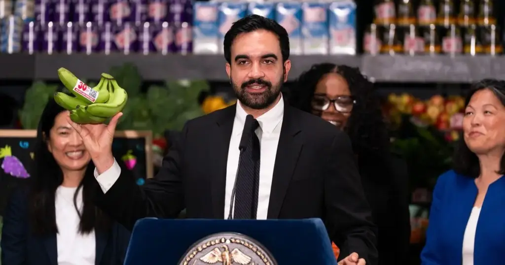
Even if you are a firm believer in New York City Mayor Zohran Mamdani’s ambitious pilot plan to establish city-owned grocery stores, it can be difficult to shake the mental images that the term traditionally conjures. For many, the phrase invokes dingy, gray Soviet-era commissaries, endless bureaucratic lines, or the scuffed linoleum floors and harsh fluorescent lighting of a 1980s DMV office.
However, the visual branding and identity for the mayor’s new subsidized grocery stores are slated to look like anything but a government-run institution. Instead, those efforts are being spearheaded by a collective of design firms well known for creating dopamine-inducing zigzags, playful retro typography, and remarkably zingy names that dominate modern pantry shelves.
The creative minds tasked with developing the look and feel of New York City’s lightly subsidized milk, eggs, and fresh produce are the exact same people who brought consumers Graza olive oil housed in its signature, squeeze-friendly green tins, alongside the psychedelic Magic Spoon cereal boxes featuring wizards riding cartoon rabbits.
The design elements behind those commercially viral products were handled by Gander, a Brooklyn-based branding firm that won the city’s competitive call to envision the visual identity, aesthetic, and overall branding for New York’s initial wave of five municipal supermarkets, the first of which is slated to open as early as next year.
The request for proposals was issued by the New York City Economic Development Corporation. Last week, the agency announced three additional specialized firms that will work directly under Gander to bring the project to life: Noble Signs, the shop responsible for the vintage-looking exteriors of Radio Bakery and Upside Pizza as well as the charming transformation of a Park Slope storefront that famously flipped "Wash" into "Mash"; Librarie, a boutique consultant specializing in strategic copywriting and high-level communications; and Seven Roots, a Wisconsin-based company with extensive experience building independent grocery stores and community-owned co-ops.
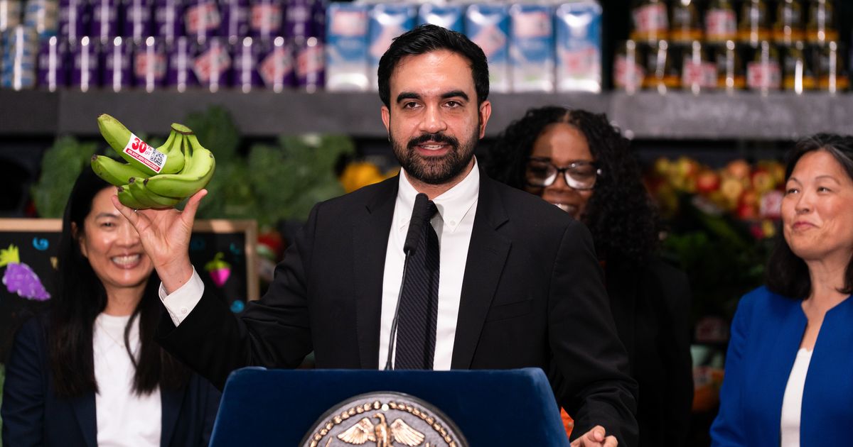
The assembled mix of collaborators makes logical sense given the multifaceted challenges of launching a municipal retail operation. Noble Signs understands how urban retail looks from the street level and can assist with the crucial way-finding placards and exterior signage that will guide shoppers efficiently toward their rice and beans. Librarie will tackle the complex challenge of giving the stores a permanent name, since "N.Y.C. Groceries" currently serves merely as a temporary stand-in, while bringing vital expertise in navigating brand crises, such as the political minefields inherent in opening a government-backed grocery store in America’s largest city. Meanwhile, Seven Roots ensures that the project remains grounded in retail reality rather than existing merely as an aesthetic exercise, advising on crucial functional matters including aisle width, checkout flow, and efficient restocking procedures.
While Gander was cited by city officials for its deep expertise in the grocery and consumer packaged goods space, its actual hands-on experience in traditional brick-and-mortar grocery retail is largely limited to Pop Up Grocer. That enterprise constructs temporary retail spaces that feel less like neighborhood markets and more like high-fashion boutiques designed to highlight niche, trendy products, including specialty mushroom chocolates and antelope-liver supplements.
Public details regarding the upcoming city stores remain relatively scarce, beyond the confirmed neighborhoods and the reality that three of the initial locations are still actively being worked out alongside projected opening dates. Still, a hyper-focus on design and visual branding is entirely typical for Mayor Mamdani.
During his recent mayoral campaign, Mamdani utilized graphics that explicitly evoked the hand-lettering styles of yesteryear. After taking office, he redesigned the ceremonial keys to the city handed out to returning sports stars like Knicks players, and he received widespread praise for the branding campaign surrounding the city’s World Cup initiatives. That latter effort included limited-edition jerseys that quickly went viral online, famously featuring tiny graphic pigeons—an artistic addition that the mayor personally insisted upon including.
Still, this intense institutional focus on trendy branding feels slightly incongruous for a retail initiative built on a fundamental, working-class promise: to aggressively cut out middlemen, reduce corporate profit margins, and lower food prices for everyday New Yorkers. Critics and design observers note that deploying cutesy, aesthetically driven branding in the contemporary "shoppy-shop" manner could inadvertently undermine that core economic mission. It risks implying to skeptical consumers that a fancy-looking jar of peanut butter or a stylishly packaged bag of lentils would have cost significantly less if the city had not allocated taxpayer funds toward making those goods look trendy.
Reflecting a common sentiment among city residents, one user on Reddit wrote in response to the design team announcement, "I’d be shocked if this doesn’t end up as something slightly cringe with graffiti murals of a bodega cat ordering a baconeggandcheese from a pigeon while pizza rat waits for his chopped cheese."